

Table of contents
In this guest article, SRE experts John Arundel and Andy Pearson show you how to connect your Checkly data to Prometheus and Grafana, as part of an integrated observability pipeline.
Metrics, metrics everywhere
It's a data explosion. Servers, clusters, pods, microservices, response times, resource usage, web traffic, monitoring statuses: modern infrastructure generates a heck of a lot of data, and it all has to go somewhere.
These days, that somewhere is usually Prometheus, or something very much like it.
Prometheus is an open source database for collecting, storing, and querying metrics data, which looks like this:
# HELP process_virtual_memory_bytes Virtual memory size in bytes.
# TYPE process_virtual_memory_bytes gauge
process_virtual_memory_bytes 1.175552e+08
# prometheus.yml
- job_name: 'checkly'
  scrape_interval: 30s
  metrics_path: '/accounts/993adb-8ac6-3432-9e80-cb43437bf263/prometheus/metrics'
  bearer_token: 'lSAYpOoLtdAa7ajasoNNS234'
  scheme: https
  static_configs:
  - targets: ['api.checklyhq.com']
Set the metrics_path to the API endpoint URL from your Checkly integration settings (everything from /accounts/... onwards). Set the bearer_token to your own bearer token value.
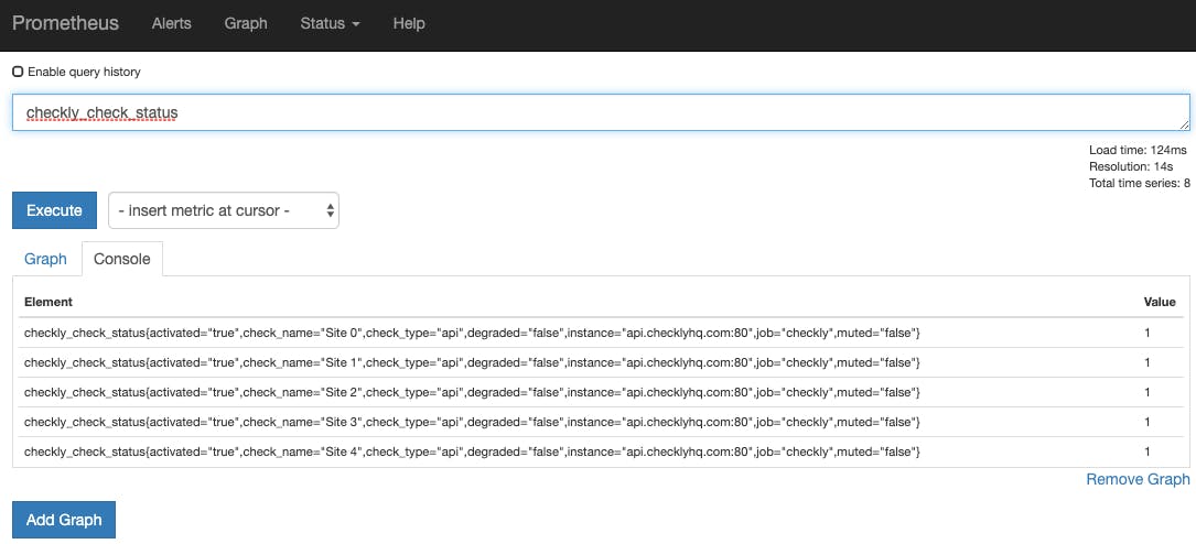
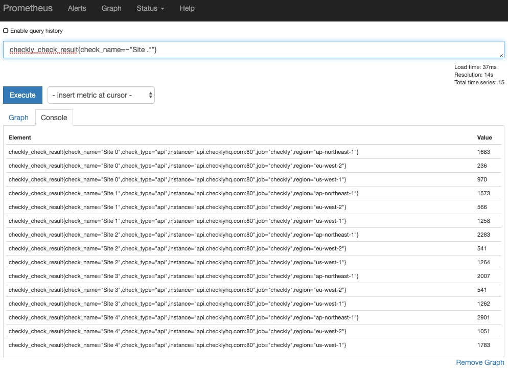
Apply the new configuration to your Prometheus server and within a minute or so, it should start collecting metrics. To check this, go to the Prometheus web interface and enter this query:
checkly_check_status
Once some data has been collected, you should see it show up in your Prometheus query browser:
Graphing your data
Now that we have the data available in Grafana, what can we do with it?
The first and most obvious thing would be to graph the check status across all your sites. For example, you could add a dashboard panel with a Prometheus query like this:
checkly_check_status
For this metric, a value of 1 indicates 'Pass' (site is up), and 0 indicates 'Fail' (site is down, or is returning an error, or an assertion is failing). So when all sites are up, as they should be, you'll see something like this:
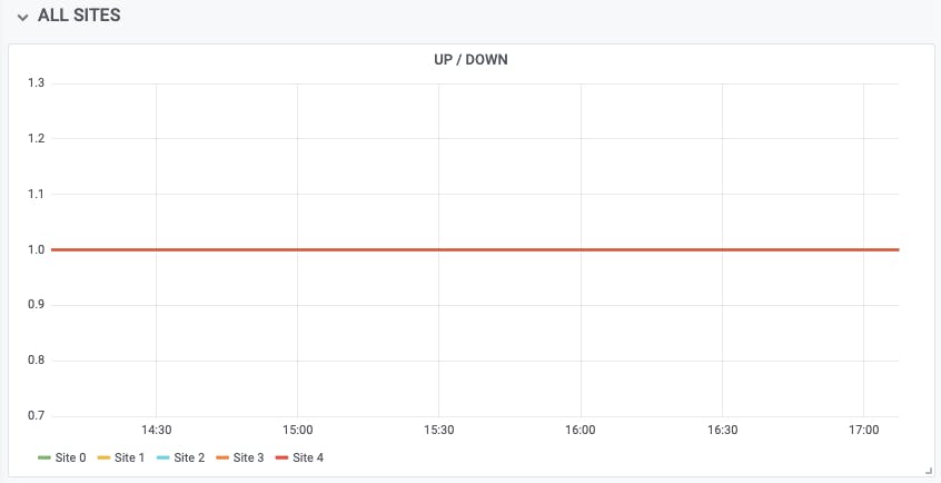
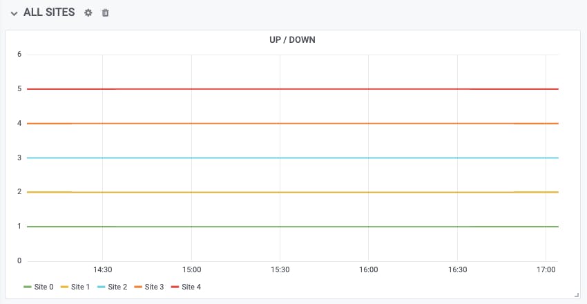
All five of our test sites are at status 1, so there's just one line. If you want to see each site as a separate line, enable the 'Stack' option in the Grafana visualization settings:
This is a good way to see the current status of all your sites over time. But suppose we want to answer the question "What percentage of my sites are up at any given point in time?" Another way to ask this question is "How reliable is my site serving infrastructure?"
Reliability
We can answer the 'reliability' question by visualizing the average check status as a percentage. For example, if you have five sites, and two of them are down at a given moment, your 'reliability' graph would show 60% at that moment in the time series. Here's the query:
avg(checkly_check_status) * 100
And here's what it looks like:
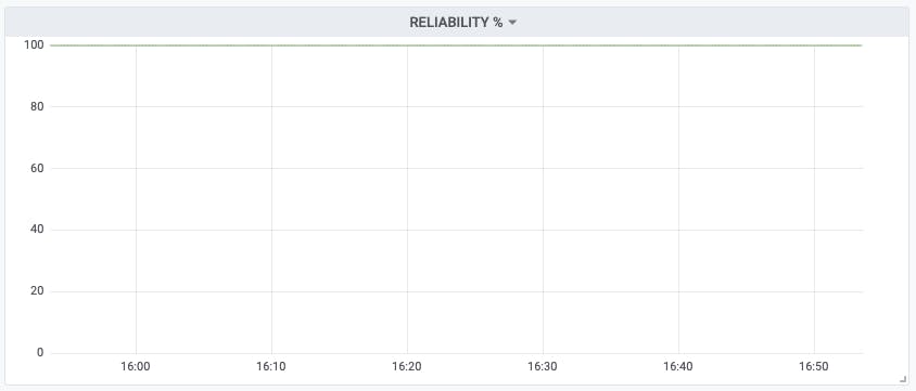
You may like to review this 'reliability' graph from time to time with your engineers. Minor dips and wiggles are to be expected, of course, but over the long term you should expect to see this graph steady or improving. A gradual (or worse, rapid) decline in reliability wouldn't be a good sign.
We can also cross-reference the check status data against other metrics. For example, you could visualize reliability against your cloud hosting bill! As you spend more on cloud, you can see what return you're getting in terms of reliability improvements... or not.
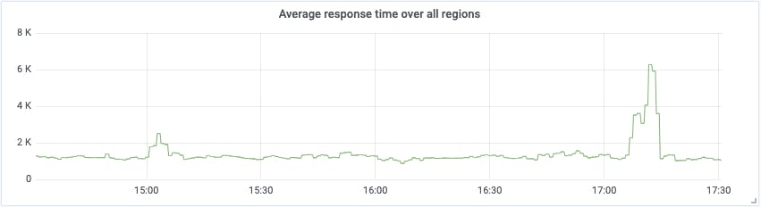
Graphing latency
The check status is very useful, but we have more data to play with. The checkly_check_result metric gives us the response time in milliseconds (referred to as latency) for each site, for each region it's checked from:
It might be interesting to graph, for example, how the performance of a single site varies by region. We could use a query like this:
checkly_check_result{check_name=~"Site 1"}
This will show only results for Site 1, but with a separate line for response data from each region:
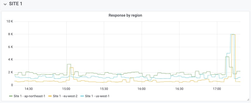
In this data, for example, we can see a spike in latency after 17:00, which affected the eu-west-1 and us-west-1 regions considerably, while ap-northeast-1 fared slightly better. Reviewing data like this over a long time period can help you make the right decisions about where to host sites for best performance, or which geographic areas may have been more or less affected by an outage, for example.
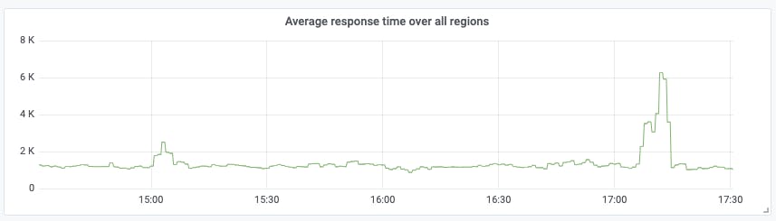
It's also useful to see the average latency across all regions, with a query like:
avg(checkly_check_result{check_name=~"Site 1"})
This evens out fluctuations which may be due to local network issues, and gives you a sense of what your global performance looks like:
Graphing region performance
It might be interesting to ask the question "Which region has the best response time for all my sites, and which the worst?" For example, we could write a query like the following:
sum by (region) (checkly_check_result)
This shows us the total latency for all sites from each region. The result looks like this:
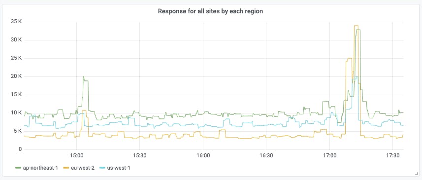
We can see that, across all sites, the eu-west-1 region is clearly the fastest; customers in that region have the best experience of your sites. The us-west-1 region is a little slower, and the ap-northeast-1 region is slower still. It might not be a bad guess that all the example sites are hosted in the EU, which is in fact the case. The differing response times of the other regions reflect global internet topology: the EU has fast links to the USA, but traffic to Asia takes longer.
Where most of the customers for a particular site are clustered in one region, as sometimes happens, you can use data like this to help you relocate sites to the most appropriate region.
If a particular region suddenly shows a big blip on the graph, that could indicate a network problem affecting that region, and you might be able to take action to fix the issue for customers in that area by deploying a local replica, for example.
Combining Checkly with other metrics
The monitoring data supplied by Checkly is useful in itself, as we've seen, but it can be even more useful when you combine it with other metrics. For example, suppose you suspect that one of your servers is getting overloaded, and you see occasional alerts for excessive CPU usage. How can you tell if this is causing site outages?
Since Grafana can graph more than one PromQL query at once, we might give it the following queries:
(1 - avg(irate(node_cpu{mode="idle", node=~"web164"}[15m])) by (instance)) * 100
checkly_check_status{check_name=~"Site 1"} * 100
The first query calculates the percentage of CPU utilisation for a specific server over a 15-minute period. For example, if the CPU was pegged at 100% usage over that time, the graph would show 100%.
The second query shows the check status for a specific site, as a percentage (so that it's on the same scale as the first query). When the site is up, the graph will show 100%, and when it's down, 0%.
The resulting graph might look something like this:
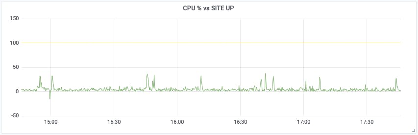
It's now much easier to see if a particular CPU spike coincides with monitoring failures.
Performance against SLA
It can be hard, when looking at a bunch of graphs, to know what you're really looking for. For example, if you're looking at a latency graph for a particular site, is there a problem or isn't there?
Maybe, maybe not. We can simplify things considerably by setting ourselves a Service Level Agreement (SLA), which for our purposes here simply defines what 'problem' means. If we say the SLA for a given site is 2000ms, we are saying that if the response time is below that, everything's fine, but if it's over that, there's a problem.
This means that we can produce a graph that's much easier to read: whether or not a given site is over SLA. For example:
checkly_check_result{check_name=~"Site 1"} > bool 2000
This will show a value of 1 on the graph when the site is over SLA, and 0 when it isn't. The results might look like this:
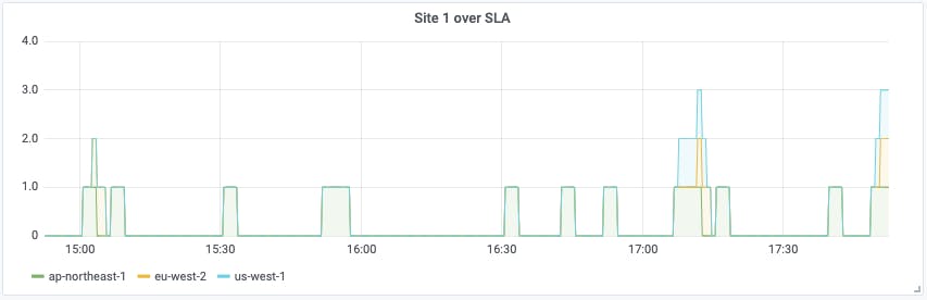
We can see clearly that there have been several out-of-SLA incidents in the last few hours, mostly from the ap-northeast-1 region, but after 17:00, all three regions tripped the SLA alarm. Breaking the data down by region like this helps us eliminate 'local' latency problems, and spot incidents where (since all regions are affected) we probably have a server issue.
Tripwires
One other useful thing monitoring can do is supply us 'quick glance' information. Sometimes we just want to get a very high-level overview of what's going on: basically, answering the question "Is everything okay?"
So one final Grafana dashboard you may like to set up is one we call 'tripwires'. A tripwire is a danger signal, like a check failure, or a high-CPU alert. One or two individual signals probably aren't a concern. But if multiple things start tripping your tripwires at once, you may have a full-scale emergency on your hands.
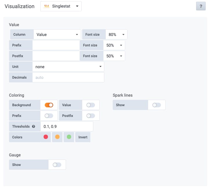
Your tripwires will likely be repeaters of existing graphs or metrics you already have, but clustered together in one place for easy visibility. It's a good idea to use Grafana's 'Singlestat' visualization for this, which shows a metric or query as a single number, with an optional green, yellow, or red colour depending on the value.
For example, we could take the 'check status' graph we looked at earlier, and turn it into a Singlestat tripwire that answers the question "Are any sites down right now?"
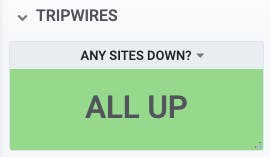
We can start with a query like this:
avg(checkly_check_status)
We choose the 'Singlestat' visualization type, define the thresholds for yellow and red status as 0.1 and 0.9, and set the colour mode to 'Background':
Just showing the number '1' would work, but isn't very informative, so let's map the different values to some appropriate wording:
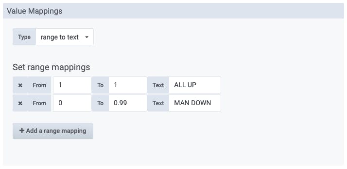
Now the range '1 to 1' will show the text 'ALL UP', and the range '0-0.99' will show 'MAN DOWN'.
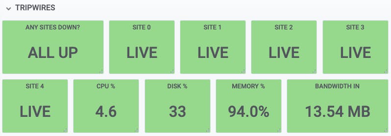
Here's a small example set of tripwires that could be useful. 'Any sites down' is the most important one, followed by tripwires for each individual site, and then CPU, disk, memory, and network usage, with appropriate colour ranges defined for each one.
When you have multiple servers to monitor, you can have the tripwire show the highest value in each category. For example, if your busiest server is running at 89% CPU, your tripwire would show '89%'.
The exact set of tripwires that you find useful will be specific to your infrastructure, and you will probably be able to refine it over time, based on your experience. But if you start with a few sensible ones, such as check status, and 'site over SLA', for example, you won't go far wrong.
Conclusion
If you're not already using Prometheus and Grafana to collect, query, visualize, and alert on your infrastructure metrics, this is a great time to start. You'll find it gives you some important advantages over more traditional 'up or down' monitoring, and some powerful tools for diagnosis and troubleshooting.
Connecting your existing Checkly monitoring to Prometheus and Grafana is very easy to do, and really worthwhile. Not only can you bring all your infrastructure data into a single portal and graph it, you can set up more complex queries and alerts based on combinations and aggregates of metrics.
If you're not already using Checkly to monitor your sites for status, performance, and user experience, that's something well worth looking into. You can try the service for free for 14 days, and that includes the Prometheus/Grafana integration. Enjoy!
John Arundel is a consultant, Golang trainer, and the author of Cloud Native DevOps with Kubernetes. You can find him on Twitter as @bitfield.
Andy Pearson is a DevOps and SRE expert, web developer, and parkour teacher at London Parkour.
banner image: detail from "Bird on a Blossoming Peach Branch". Shizuo Ashikaga Hatsui, ~1950, Japan. Source